Design Principles Exercise
Contrast and Emphasis
My
idea for contrast was meant to be simple yet effective, inspired from
imagery that I've drawn and basing the whole emphasis of this piece on
one of my DnD characters that I have written and played as throughout
the whole of last year.
Initially,
I wanted to create a partial view of the sword almost as if it is lying
down on the ground, in the same vein that when someone is disarmed and
dropping their weapon to the ground.
Initial Piece
I
then added the blood stains to signify the violence this character has
gone through and to contrast the sword and blood with the bright pink
background. However, I did not proceed with this piece, mainly due to
the lack of impact that can showcase said violence and the general
composition being too simplistic.
I
took inspiration from a piece that is tied to the video game,
ULTRAKILL. The sharpness and bold contrasting colours would fit
perfectly with this piece.

My Inspiration
Sword Sketch
I
decided to rework my efforts and to put more of an emphasis on the
sword itself. I created a sword from the ground up and utilized it to
shape my piece. However I realized the finer details were not necessary
later down the line.
Final Sword Design
I
removed the details and went with a silhouette type of look and also
added a little bit of motion blur to give the sword a sense of movement.
I also turned it white to contrast well with the black background.
Added Blood Impact
I
proceeded to add the blood splatters that go in the opposite direction
of the sword to better visualize the piercing impact imbued by the
forceful downwards movement of the blade. Also turning the blood that is
overlapping the sword a jet black to better contrast the sword and
blood. I then proceeded to add some motion blur for extra impact.
Symbol
Following
the sword symbolism shown in the last section, I wanted to continue
said symbolism in here both in relation to the character that I based
this off of and the sword that ties into said character.
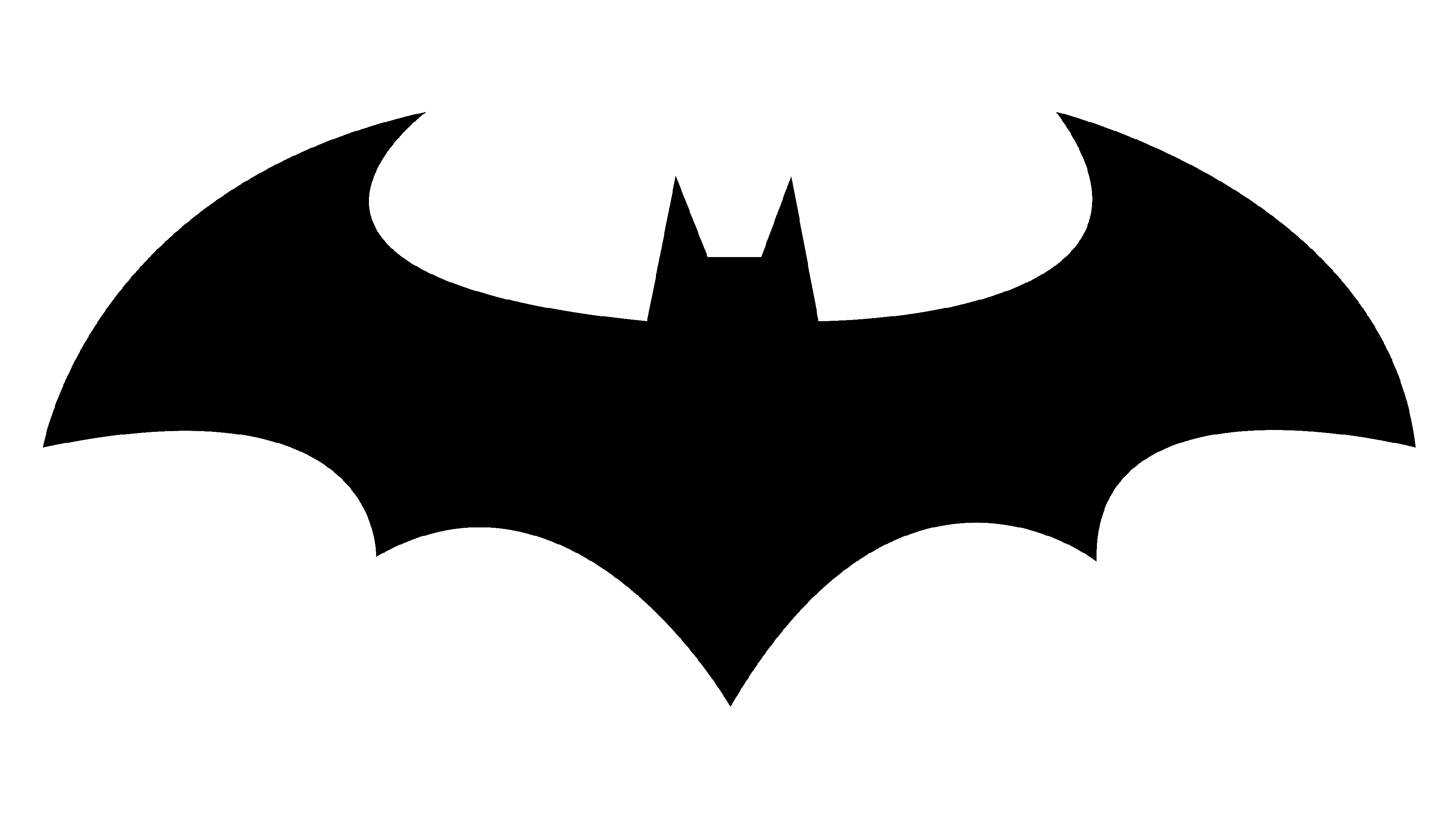
I was inspired by the bat symbol due to it's sharp ends but also curved edges to give both a threatening yet good hearted aura.

My Inspiration
Initial Sketch
Colored Sketch
Added Sword
I
decided to place the sword in between the wings as not only does it
create a balance in symmetry, but it also still retains that sharp
bird-like appearance. The sword is already a big part of said character
and I felt it would not be appropriate to remove that.
Final Design
The
final design was conceived to be more symbol-like, as there were simply
too many colors spread out onto the piece and hence, I deemed it
necessary to change it to be only black as red was simply too bright of a
color.


Comments
Post a Comment